Thursday, April 29, 2010

Spring Reading

This week at One Powerful Hour I set the theme of Spring.

Where I live Spring has fully sprung. One minutes it is warm and sunny the next raining, cold and windy. The flowers are blooming and the allergies are rampant :)

One of my favorite things to do in the Spring/Fall is to read outside. However many times I find myself sitting inside reading looking out at the not so perfect weather. So this is my interpretation of Spring. It may be beautiful outside but you can't always go outside.

All the images, paper and German Scrap for this piece were purchased from Alpha Stamps . The flowers are cut from one of the beautiful papers and then I added some sparkeling H2O's to make them shimmer.

This ATC is also featured on the Alpha Stamps web site (yahoo yahoo) HERE (scroll down the page). I made it for a swap that I am hostessing through the Alpha Stamps Yahoo group. A season themed ATC swap 3 for 3. We have just completed Spring and I am gearing up for the summer swap. Come and join us!

Thursday, April 22, 2010

Joan of Arc...One Powerful Hour Style

This week over at One Powerful Hour Nancy has set a fabulous theme...

Military Women

What a wonderful way to honor not only our military but the women who are among these fine leaders.

When I think Military Women I really think about today's women but that did not really work with my art style. After thinking on it for a bit I decided to use an image of Joan of Arc that I found on the web.

The base that I built on is a really shinny silver that did not come across in this photo at all. I stamped it with a background stamp from Stamp Camp and then affixed the stained glass window and the image of Joan. Stamped some french script across the bottom and then added the German scrap. As a finishing touch I added the cross in the same silver paper as the background and of course I had to add rhinestones.

Not my best piece but I do like it and it looks totally different in person.

Wednesday, April 21, 2010

My personal Sea


A new challenge blog has hit the scenes and if you haven't checked it out yet...well you should.
Alter it Monthly's first ever challenge is a Matchboxes.

I've never done a Matchbox and since i had a month to play with it I thought why not. Well it was harder to find matchboxes than one would think, but eventually I got some.
Paula's Kit Club frequently has wonderful cameo's in it. My favorite are some that came in the Something's Fishy kit but up until now I have not known what to do with them. This challenge gave me the perfect opportunity to feature one of them.

The Matchbox and the Cameo sat on my studio table taunting me for a bit. For some reason I just could not wrap my Brain around what to do with it. I took a trip over to Alter it Monthly and viewed some of the entries. Someone has cut an opening in the top of their matchbox and the light bulb went off in my head...finally.
I traced the cameo on the front and cut out the opening. Next I primed the box with some Gesso, trying to hide the red of the matchbox and get some grip so that my texture paste would stick. After that was dry I added the texture paste and smushed the Cameo into it. This stuff took forever to dry, I had to leave it overnight. I am not sure if it is because the Gesso didn't dry or if it had to do with the cardboard of the box.

I used Twinkling H2O's to paint the texture paste, 3 different shades of blue. Then I added glitter. When the Matchbox was open the bottom looked very blank so I colored it with the Twinkling H2O's also then added the transparency from Alpha Stamps finishing it off with a thin layer of glitter.

To complete the Matchbox I glued sequins onto the sides, I was trying to get it to look like exotic fish scales, not so sure I accomplished this. To me the top looked a bit plain so I pulled out another fabulous Paula's Kit club item (the blue fish) strung some fishing wire through it, attached sequins to the fishing wire and walla, a fish tail.

Not only am I glad that I did this project so that I could take part in my friends fabulous challenge blog but I also learned quite a bit.

Hope you enjoy!


Friday, April 16, 2010

Elements of Dance


April for the Circle of Friends means Dance themed ATC's. I joined this swap at the last minute when inspiration thwacked me upside the head.


I have always loved Dance, Ballet in particular, probably because I am one of the least graceful beings to ever walk the Earth. So of course my ATC had to be all about Ballet. The colors I think of, the textures, the music...I could go on an on.


I started knowing that I wanted my Ballerina to be wearing a skirt/tutu. I used the same fabric most tutu's are made from, tulle. To hide where I inserted the fabric behind the dancer I added a very thin piece of rick rack. The other thing I think of when I think of a Ballerina's wardrobe is glitz so of course I added glitter. And one can not forget tights...so her legs are colored in a skin tone, which is what most tights look like.


After I had my Ballerina all set I kind of wondered where to go. Music, a Ballerina can not dance without Music. Actually that probably isn't true but I've never seen a performance without music. So I stamped a music score randomly all over the background.


The final element I knew I wanted to add was a bouquet. I have never seen a Dancer not holding a bunch of gorgeous flowers at the end of a performance. I got these flowers from Alpha Stamps, they have a fabulous selection of 3D flowers.


I know this picture is a bit funky, can you believe it is the same flowers as the ones above. It looks so good from straight on, not so much this way but I wanted you to get the feel for all the 3D elements and textures.


When I had all these elements on I realized I needed to fill some space so I added the text.


Believe it or not I am not pleased with this ATC at all. I don't know if it is because it seems simple when looking at it or if it's the colors, it may even be the subject matter (I've always had a terrible time when presented with the challenge of Dance). to try to make up for what i think is not my best work I decided to slip the ATC into a custom made envelope that I hope resembles a ballerina's shoe.


The way a dancers shoes lace up have always intrigued me. I think it is very elegant...and I hope that is reflected here. I selected the pink satin fabric because that is what I have always seen the shoes covered in.


Because the fabrics I selected are so slick I used fusible webbing between them to provide stiffness...it also helped hold them together when I punched the holes for the eyelets.


When I drew out my template I thought I took into consideration some extra but the fabric envelope is a bit tight for the ATC...the recipients will probably need to fluff the skirt and flowers on the ATC when they open this.


Well, they are all packed up and ready to head to Andrea, our hostess this month. But I couldn't send them off without doing a bit of mail art.


I stuck with my color theme of pink and green. Added some shimmer by stamping a background stamp with versamark and using Pearl Ex powders all over it. A bit of pink paper featuring a portion of a chandelier adds a bit of elegance (in my opinion) And lastly added the dancers.


Hope everyone likes what I have done...more than I do.


Could not put it down...dove into the next book!


If you know me at all you know that I have a weakness for Young Adult Vampire Books (heck it's better than bodice rippers...not that I don't read one or two of those every now and then). Well, I think this is my favorite so far, yep, I liked it more than Twilight!

Why, How, OMG...you may be saying what could topple the great works of Stephanie Meyer??? Well, Caine's writing is very different, not so beautiful. She is down and dirty, her characters are flawed (like teens and everyone are) her setting is dark (but only in the shadows b/c vampires don't want their existence publicly known) and the situations play out the way they probably would in real life.

Real Life! You say, what is real about Vampires. Well, nothing but there is a lot real about teens and how they react with one another. In this novel Caine's heroin is brutally teased and then ends up in a fist fight (a number of times) with the "bad guys". The romance line builds very slowly which in my opinion was the right approach a sixteen year old with a nineteen year old is a bit of a touchy situation (I should know I've been there). Caine handled it exquisitely.

I could go on and on but I will leave you with this. Caine does not wrap up the book in a nice neat little package...I actually went searching for the second one with a flashlight at midnight to see what happened to one of the characters. Talk about a cliffhanger! I am now over 50 pages into The Dead Girls Dance and it is even better...so far.

Thursday, April 15, 2010

Inspirational Patchwork

This week over at One Powerful Hour Peggy has selected the fabulous theme, Patchwork.

Initially when i saw the theme I thought of quilts with perfectly sewed together and cut bits and pieces. So I decided to make some kind of paper piece using the strict geometric formula. I bounced around a few ideas of taking my favorite themes, doing small pieces, cutting those up and putting them all together but I just couldn't envision it. Then I came up with the idea of a Mixed Media Patchwork, all the mediums I use in my pieces, and that one stuck and took off.

I did start by trying to stay very geometric. I found some marble bits (to represent glass) cut up some of my custom made papers in little squares and started to build the piece. That's when it all went haywire, from the geometric standpoint.

At this point the black paint was drying on the canvas and I had drawn a mock 5x7 piece on my work pad to space things out. That's when I stopped, wrote down everything off the top of my head that I use in my art and then went and gathered it.


The list had on it
Stone
Sand
Wood
Paint
collage Images
Stamps
Glitter/Rhinestones
Wax
Fabric
Ribbon
German scrap
Paper
Transparency
Twinkling H2O's
stickers/rub on's
Ink

After I gathered items that represented each of these the piece came together in no time. Some of the representations are easy to spot but other's are not.

I took the transparency film off of the image to the left so you could view it without the distortion.

I stamped my favorite go to stamp a swirl by hero arts and used Kaleidoscope embossing powder on it to represent glitter. There is was all around the frame on the woman in the middle. The sand is at the bottom where the wooden words are. I used texture paste and put sand all over the top of it. Tim Holtz distressing inks are one of my go to items so I rubbed those on the wood before stamping the phrase "one of a kind".

The female images are from Alpha Stamps. The German scrap bird is from a Paula's Kit club.

The word Inspire, when I rubbed it on for some reason the "p" did not transfer at all...I consider this a fortunate mistake because I love the way the metal p looks.


Finally after all that was done and it looked nothing like my original patchwork idea I thought to add a transparency film over it with stitching stamped on.

I am no novice to trying to photograph things with reflective surfaces but for some reason this one gave me hell. Any suggestions would be welcome.

Well, I think that is about it...When I finished this piece and stepped back i really really liked how it turned out. This maybe become my new favorite piece.
Thanks for looking!

Wednesday, April 14, 2010

All You Need to Know About Alcohol Inks...Class

I'll be teaching my first Stamping/Crafting/Art Class in May.


Here is all the information you as a student may want...feel free to ask questions I'll answer as soon as I come up with an answer...wink wink...


Who: Taught by me (not a professionally schooled artist, completely self taught)

What: An afternoon of fun, food and art. You will learn how to use Tim Holtz Alcohol Ink's in a Number of ways, for backgrounds, as a paint, and to alter non porous surfaces.


You will leave with 3 Completed projects, A card, Coaster and Magnet (all pictured here, these are just samples, you can copy them or come up with your own design using my abundant stash).
When:
May 12th at 1:30 PM
Why:
Alcohol inks are expensive and you don’t want to go out and buy a bunch if you are not going to like them…so come try them out to see if they are something you would like to invest in.

To hang out with the girls…because that is just too much fun!

To learn something you didn’t know before.

Fee:
$5.00 per person paid in Cash (before or at the party) or to my pay pal account cmoh@earthlink.net (before only).

What to Bring:
Yourself, any art supplies you may want to use (of your own…my stash will be open to all) Please wear something that can get messy, you may also want a pair of gloves (the alcohol inks stain your fingers). Children are allowed, to play or to take part.
Can't wait to see you!


It's an Ocean Out there

The March Circle of Friends Swap is finally all done and ready to go out my door! We made Ocean Themed ATC's and every single lady did something totally different and totally fun. You can view my contribution HERE

And to top off a fabulous swap I received wonderful gifts...thank you ladies I love all of the items and I can't wait to play with them.
Be looking for a little ocean in your mailbox in the next few days!

I'm now drowning my sorrows in Bon Bon's

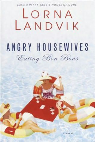
So for the past few days I have been a little in the dumps, why…because I was reading this horrible book! Angry Housewives Eating Bon Bon’s may possibly be the most depressing book I’ve ever attempted to read. I say attempted because I only managed to trudge through 198 pages of it, and that was more than I should have.

So five women living on the same street get together and form a book club. Each has their own reason for needing this gathering because every single one of them has a horrible life! Landvik took all the negative things that can occur in childhood, marriage, and friendship and gave every single character at least one of them…if not more. There was no light at the end of the tunnel, no character that you could read along with and be relived that she had a good life it was just bad bad bad. I was under the impression that this book was suppose to be funny, maybe that is why I found it so depressing but there are some things in this book that are now seared in my mind that I so with weren’t…and the really bad thing is that these scenes added nothing to the book!

Angry Housewives was a book club selection and I can only hope and pray that the members of my club do not have, nor will they ever, the troubles these women faced on a daily basis. I do foresee a good discussion though, so at least I have that to look forward to.

Friday, April 9, 2010

It's Tea (or Coffee) Time

This week over at One Powerful Hour Nancy has set the theme, Time...

Since Tea is one of my favorite themes to work with I decided to go with "Tea Time".

A few weeks ago I did a project that used the chipboard cup shape (Green or Black...Tea that is) and a friend of mine said she really really liked it. Of course I told her she could have it but wouldn't it be so much better if I gave her a completed chip board book instead of just one cup. So I decided to build my piece on the cup.

The background is the definition of Tea stamped over and over, with the tea flower color in pencil. The female image is from a collage sheet provided in a Somerset Studio's magazine. The cups are from Paula's Kit Club and the words I printed off of my computer.

I wanted to have something around the words so I used gold embossing powder and then rubbed it with black alcohol ink...I was attempting to get it to look like the gold on the clock. Not so sure it worked...but I am glad I tried. I did two layers of gold embossing, I think if I could do it over I would only use one.

Since the chipboard cup obviously has a back and when you turn the pages it will show I decorated the back also.

The friend I have in mind to give this to is more of a coffee drinker than tea drinker so I did a coffee page.

The background paper has keys all over it but the image ended up covering most of them up so I added an actual key (have no clue what house or door it goes to, hope I don't need it). The phrase I have either heard somewhere or made it up. For a finishing touch and to add more depth I added diamond glaze to the stamped coffee beans.

Hope you enjoyed!

Tuesday, April 6, 2010

The Crow Girls

This is my first journal entry for the 2010 Circle of Friends Journal Rotation and I had a blast with the theme. Cheryl's journal is all about phrases and how they inspire us...and let me tell you she has some crazy phrases to pick from. I went through all of them, pulling out some that struck me and then, when I pulled out the very last slip of paper I knew I had struck gold...or shall I say black. The phrase I selected was "The Crow Girls" This is an image of some of my Great Great Great...Grandmothers. My own Grandmother told me the story of this photo a few years ago and I have been enamored with it ever since. Back when this photo was taken it was considered "making it" if you owned a black silk dress, could get dressed up and have your photo taken. Well, that is what these women did and when the photo was developed someone said they looked like "Three Black Crows". So I twisted the journal phrase and the family phrase and came up with this piece. I knew automatically that I wanted to do a "spinner" I've never done one of these before and the geometry and mechanism behind it had me stumped, but only because I was too focused on the art. As soon as I stepped back and thought out the spinner portion the rest came easily. I didn't want people to have to spin the actual photo, so I wired the image and spinner stuff and had an opening on the back so you could spin a button but I used a glue that was really strong and when I went to twist the wire through the button it broke (the wire, where it was not attached to the glue, so the wire is glued all the way through). I am keeping my fingers crossed that the hole piece doesn't fall... To start I crackled the paper, old fashion style with crackling medium. Then I added the black "dots" using a stencil and black paint. While all this was drying I created the crows stamped it twice on grungboard, cutting them out, then painting them with black paint and covering them with Modge Podge to get it nice and shinny. I covered the Dress Form Die Cut with black glitter but first I painted it black. I did this in case the glitter did not cover completely, you can't see any holes this way. After all this it is finally time to put it together. I affixed the photo using my newest toy, wax! I painted some extra wax around the edges of the image and then dribbled some all over the page. I also used the wax to affix the crow girls names. With the photo in place I affixed the spinner on the back and then attached all the other bits and pieces. Finally the front was done. To allow for easy spinning I placed spacers (small pieces of wood) on the back of the front sheet before attaching the back paper. On the back I printed out on transparency the "Three Black Crows" story. I layered this over a corresponding paper from the front (where I attached the phrase I used. Attaching the phrase is one of the "rules" of this journal. I used a Tim Holtz plaque to make it stand out and covered it with diamond glaze). The lace is some that my grandmother handed down to me I'm very stingy with it but thought it went well with this piece and it is symbolic (to me at least). As a finishing touch on the back I added some black flowers that I received in a Paula's Kit Club. They are fabulously detailed, the picture does not do them justice! Well, I am very pleased with my first Journal entry for 2010. I hope Cheryl likes what I have done and that all the other members of Circle of Friends get as much enjoyment (and learning) out of this journal as I did. I am entering this into the Darkness Inspiration Challenge Blog, this week it is Dark Birds, last week it was Dark Ladies...I didn't make that cut off.


Saturday, April 3, 2010

One Wild Ride…or shall I say one wild slippery space???

This is book 2 (of currently 4) and I felt at the start that I had taken too much of a break between reading Gabriel’s Ghost and Shades of Dark. I had forgotten what many of the “made up” terms were and some of the characters, only briefly referred to in Gabriel’s Ghost were key players (behind the scenes) in this book. That being said, I loath books that hit you over the head fifty billion times with what happened previously. And after reading a bit I caught back on…however I think this may have contributed to the book not grabbing me right away.

The love story is dark, and I am not use to reading dark love stories…but it is exactly what needed to happen and I can’t wait to see what is next for Chaz and Sully. The main reason this story line is dark is due to what Sully is, a Kyi, which he does not fully understand. This causes him to make a few mistakes with Chaz and other characters while he is trying to “find himself”.

The character development continues to grow from the first book and I find that I like other characters more and more. As for the last 50 pages, I could not put the book down! Talk about an exciting ending.

And I highly recommend downloading the play list, it is a great compilation with the book.