Have you ever wondered what is happening a stack or two over from where you are studiously reading a book in the library? How about all those whispers you hear? Well, in my library, all secrets are revealed.
This month, Leslie, over at Alpha Stamps, asked me to make a piece of art that represented my studio, or other things I collect. I am an avid reader and my studio is filled with all sorts of books, heck, my entire house is filled with books.

All of the decorative papers I used and the Gate fold window card are in this months kit. Many of the other supplies I used can be found HERE.
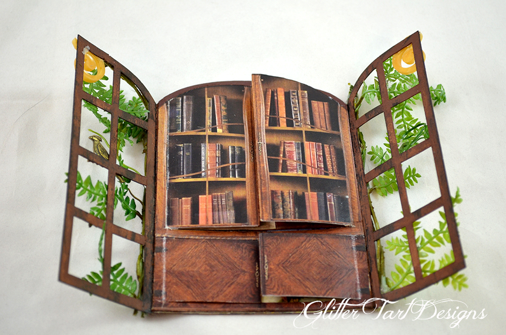
I started by carefully cutting the cabinet collage image so that it could be opened multiple ways. I lined the backside with decorative paper and added some book images. In every library there is always that student who is actually using there time wisely (that was not me in school).

But there is more, behind the card catalog (has anyone seen one of these in libraries anymore?) is a secret tryst. Alas, this does not happen in my studio, my husband tends to avoid the basement, scary girly stuff you know. This flap opens the opposite way of the cabinet, getting the spacing right on this one was a bit tricky but I love the way it turned out.

And hidden away in the depths of my library is a chaise lounge with a woman from the Paintings of Romance Collage Sheet. I would love a chaise lounge in my studio. I do have a sofa, old, covered with a sheet because the cat lives on it. If I had a chaise lounge my family might never see me.
I hope you have enjoyed this peek into my studio even if it wasn't full of art bits.
Thanks for stopping by!