Showing posts with label Paula's Kit Club. Show all posts

Friday, February 11, 2011

Something Sweet


This week over at One Powerful Hour I've selected the theme...

Something Sweet

My favorite thing to do with challenge themes are play on words. There are so many way's this theme can be taken. I decided to do a bit of both...play with the "love" aspect along with the "yummy" aspect.

A few weeks ago Sarah who is the mastermind behind Soul Journaling posted a tutorial for those of us that are members of her yahoo group. I followed her tutorial and came up with this piece.

The background on the heart is entirely covered with glitter...brown and pink. The image is from Altered Pages, the words from Paula's Kit Club and the fork from Alpha Stamps. Other embellishments include the pink German scrap (which was a pain to put on but adds a nice touch), rhinestones and I glittered the image using sticklers glitter glue.

I hope you enjoy!

Wednesday, February 2, 2011

Bee Mine

I've posted another set of ATC's for the Marie Antoinette Mail Art group. I am simply loving this new group and I'm so glad that they accepted me as a member.

This months ATC theme was a Marie Valentine. I found this image on Etsy from Olgas Designs. It was originally a bookmark but I cut it down to fit. I printed it out twice and used the entire portion as the base of the ATC and then cut out the image of Marie with the yummy cupcake and 3D mounted it.

Next I cut out a strand of the lovely heart ribbon. I got it in a Paula's Kit Club, but alas she is no more, but I'm sure you can find it somewhere else. I know Alpha Stamps carries it in red.

The Bee Hive is from Alpha Stamps. I stamped it on a separate sheet of paper and colored it using colored pencils. Before finishing it I added some pearl ex powder to the hive so it's all sparkly! I then 3D mounted it on top of the Marie image.


The final touches include a heart that I coated in diamond glaze after outlining. A metal Bee that I made look old using a salt and vinegar mixture. The ribbon banner with the phrase "Bee Mine" and a gem on the cake.

This group is way into packaging...and I have received some absolutely fabulous pieces that I didn't even want to open because the packaging on them was so lovely. So I made sure that my Marie's had something a little special about them.

Following the instructions provided by another of the MAMA members I made crepe paper flowers that I added velvet leaves and some gold sprigs to. I affixed these to a soft pink silk ribbon that I tied around the outside of the ATC envelope.


Here is a picture of the back of the ATC all packaged up with the ribbon tied...I am not very good at bows :(

I can't wait to get my exchanges everyone's pieces are always so fabulous. I hope they enjoy mine.


Thursday, December 16, 2010

Christmas Past, Christmas Present


This week over at One Powerful Hour the theme is...

Christmas Past, Christmas Present

The hostess Pauline instructed participants to take the title anyway they saw fit.

So, last year at around this time (Christmas time) I decorated a chipboard bird and have had it up in my studio all year (See Image below). So I decided to decorate the other side.

To start I used a paper that I received last year from Wendy at Repeat Impressions. I love this paper so much but didn't know what to do with it, I really just wanted to frame it and look at it but I thought this would be just as good. Next I Green Tinsel embossed a fir tree branch all over (also from Repeat Impressions). This year (to represent Christmas Present) I used the Cat German Scrap that I received from Paula's Kit club. My finishing touched include changing the cat bows to red and adding red rhinestones all around the bird.

I think I represented things received in my Christmas past and my Christmas Present fairly well. I hope you enjoy.

Monday, October 25, 2010

Red Velvet Art...

This is one of those bitter sweet (and not because the recipe calls for bitter sweet chocolate) posts. The Circle of Friends have completed another wonderful round of journals. This is the last entry I will do for this year...but I already have plans for next years journal ;)

Elisabeth wanted some yummy recipes to fill her journal. After all what goes better with art than food (and wine). So I pulled out my favorite cupcake recipe. Red Velvet Cupcakes. My recipe is very different than most and oh so yummy!

For the background I used two shades of acrylic paint. When they dried I stamped Patisserie, a Paula's Kit club stamp, in white all over. Next I stamped the mini cupcakes added glitter and painted the bottom portion with a Twinkling H2O.


The lovely retro lady and the cherries are also stamps I have received from Paula's Kit Club. I colored them with colored pencils, cut them out and attached them as shown. The recipe is printed on transparency film and affixed with a clear glue.

To finish it off I cut out a few mini cupcakes (painted and glittered like the others) and filled up the woman's tray.

I had a fun time making this piece and really like how it turned out. I could have kept adding and adding but I was already behind on mailing out this journal. I hope Elisabeth thinks it was worth the wait.

Thursday, October 14, 2010

A Apple Pie


I have been sitting on when to post my A Apple Pie Accordion Book and Sarah at One Powerful Hour has given me the perfect opportunity. She has selected the theme Apples for this week. While I did not make the entire book in an hour I know that I spent less than an hour on each of the pages/ATC's. I made this book for the Alpha Stamps Autumn Apple Pie ATC swap that I am hosting, I got a bit carried away and made a lot of samples ;) I couldn't help myself Leslie made some really lovely Collage Sheets and I just had to use them.

The cover of the A Apple Pie Book is really simple. I cut the frame from the collage image and added red glitter to it. Then 3D mounted it adding some diamond glaze to the words, some apple slices I got from an Etsy seller and placed the words along the side.

The next image on this collage sheet featured the letters A, B and C. A is for Apple Pie, B is for Bit it and C is for cut it.

The knife along the right hand side is a chipboard knife from Alpha Stamps that comes in a set, you get a fork and spoon also. I painted it with Tim Holtz crackle paint, added some glass glitter to the top of the pie and black embossed the corner bits (an alpha stamps stamp).


The Collage Sheet then moves onto letters D, E, and F. D is for dealt it, E is for eat it and F is for fought for it.

I cut this image up just keeping what the clear acrylic tags covered. The background paper is from an Alpha Stamps paper stack and I stamped an image of the alphabet in brown ink, also an Alpha Stamps stamp.

The finishing touches are some autumn hued yarn and a red apple charm that I attached to the upper most tag.


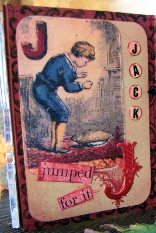
Then the collage sheet jumps a couple of letters to J. When I saw this image I immediately thought of a Joker or a Jack in a pack of cards. I decided to go with Jack because I thought the little boy looked like a Jack ;)

Using an actual playing card as a template I cut out a piece of off white paper and attached the collage image. Adding diamond glaze to the letter J and some glass glitter to the pie.

The additional letter J I used is German scrap that I got in a Paula's Kit. Then I stamped in red a diamond (the stamp set is from Alpha Stamps and it comes with one of each suite). To finish this ATC off I added some sticker letters that I edged with red and stippled red over the words before affixing them. The entire card is on top of red background stamped with one of Alpha Stamps corner stamps.


K is for Kept it...which is what I always want to do with my collage sheets.

I used the same corner stamp on the background on this ATC as I did with the letter J. Stamping it repeatedly with black ink. Then I stamped the mini stage with white ink on black cardstock and cut it out placing the image behind it. the letter K is covered with Diamond glaze and placed at the top with half of a large black German scrap medallion that I affixed a rhinestone to.


I think L is the ATC that I am most disappointed with. In one of my Paula's Kit Club boxes I got this wonderful apple paper. so of course I wanted to find a way to use it. But I think that this one just didn't come together well because I was forcing the paper. The checkered paper in the lower right is from the same paper pack as the one mentioned above and from Alpha Stamp. I aged it with some Tim Hotlz distressing ink.

On the apple paper I used some Twinkling H2O so it didn't look so flat affixing it over the checkered paper. I cut out the main portion of the collage image and put some glass glitter on the pie. Stippling green onto the words.


M is for Mourned for it. The background paper on this one is also from Alpha Stamps. I used some Tim Holtz distressing embossing powder around the edge of the image and affixed it with some green brads.

I cut out the word "Apple" and the Green and red apple at the bottom which I added the glass glitter to (I really like that stuff can you tell LOL).

I aged the words Mourned and for it and then added the word pie (using sticker letters purchased from Alpha Stamps)


Last but certainly not least the collage images jump to letter T, V and W. T is for took it, V is for viewed it and W is for wanted it. I liked this image so much that I hardly did anything to it. Of course I added the glitter glass to the pie but other than that all I did was put the ribbon along the bottom and added the sticker letters.

Right now I have this book sitting on my tool chest and have no idea what I am going to do with it. I really liked making it and I am pleased with the way it turned out and I hope you have enjoyed looking at it.

Once again if you haven't joined the Alpha Stamps Yahoo Group then you are missing out on all these wonderful swaps. The Christmas swaps are about to be announced so come join us!


Wednesday, September 15, 2010

Attention Grim Reaper

My latest Circle of Friends Journal entry. This journal is Andrea's and she asked the participants to use a stamp in their art.


I had a very hard time with this one. Luckily Andrea provided a wide variety of stamps to choose from (otherwise mine would have been a boring liberty bell stamps). With Halloween around the corner and that darker theme I have taken with most of the journal's this year I selected the spider stamp.


The color of the stamps did give me pause. I normally do not work with bright colors and I didn't want to use a black background paper. I settled on the orange decorative paper and then toned down the stamp, the thing was fuchsia! So I aged it with some brown inks. After that I drew out the spider web and covered it with the closest color glitter I could find.


The metal spider is from the most recent Halloween kit from Paual's Kit Club. I painted it with black acrylic paint. She is fabulously 3D and really creepy in my opinion.


At my husbands brilliant suggestion I decided to turn my piece into the front of an envelope (talk about postal). So I dragged out some magazines and cut out the letters. I wanted to make it look like one of those ransom letters you see in kid movies all the time. I aged the letters with the same ink I used on the stamp and then attached them.


The final touches included stamping a wave across the stamp to make it look like it has been processed by the spooky Postal Office and then to fill in some space along the left I stamped the skull and crossbones stamps from Alpha Stamps.


I had a lot of fun with this one and wish I had time to do a Christmas one...she has Christmas stamps too. But alas I must post it so the final member can add her piece before it heads home to Andrea!


Sunday, August 15, 2010

Frosty

This week over at One Powerful Hour the theme is...

The Truth about Cats and Dogs

I selected this theme for a couple of reasons 1. I love both cats and dogs 2. lots of people seem to have fun with this theme and 3. Because every time I think about a dog I can hear my father telling stories of his childhood.

The photo I used in my sample is of my dad and two of his brothers with their dog Frosty. My father is one of those natural story tellers and none of us ever grow tired of hearing about his childhood adventures. The one I remember the most about Frosty is when there was a storm that flooded the area. Frosty had been trained not to use the backyard so instead of going to the bathroom on the small patch of dry ground next tot he house he swam across the street to use the neighbors yard!

The stamp I used on the background is from Paula's Kit club. I also received the stickers and paper that I cut the bright dog from Paula's Kit Club.

Hope you enjoy!

Thursday, July 15, 2010

Knock Knock

This project is killing two birds with one stone. It is for a swap and it is my One Powerful Hour entry this week. One Powerful Hour challenged it's participants to "be inspired" by the design team. I took inspiration from two of the team members and worked it into my swap piece.

Gillian a member of one of the swapping groups I am a part of had some wonderful metal houses that she put up for a swap. I am so glad that I took part in this swap because I absolutely love the metal house, hopefully I can find some more.

She left the theme open, all we had to do was use the house that she sent us.

I have never worked with anything like this before and when I took it out of the package some of the paint (I guess that is what was on it) was flaking off. I pealed a lot of it off and then put a coat of white gesso on the entire thing thinking that this would help hold anything that I stuck onto the house.

After the Gesso dried I added Tim Holtz crackle paint to the top part of the house and then dabbed the entire thing with various shades of Tim Holtz alcohol inks. I love how the alcohol ink seeped into the cracks it really gave it an 'old' feel in my opinion. The Tim Holtz bits were inspired by Nancy at NJP Originals she loves all things Tim Holtz.

Next I added the paper bit which I filled in the swirls with gold ink...I got this idea from Amy at Paper and Gluestix she likes to doodle on her pieces and while I wish my doodling was a little bit more free form I thought it would count for inspiration.

To be honest I had no idea what I was going to do with this house so I flipped through my binder of Collage Images and came upon this owl from a Paula's kit Club. Another thing Amy does on may of her pieces of art is put fun sayings some doddled others clipped and outlined. I came up with my own saying attached it and outlined it in the same gold that I used to accent the swirls.

Lastly I added the door which is stamped using brown ink on transparency.

I really like how my house turned out and hope that my swap partner likes it as much as I do.


Monday, July 12, 2010

Janice's Secret Garden

Another fabulously fun Circle of Friends Journal.

This time it was a bit different...well a lot different. Janice wanted us to fill in her "Secret Garden". She mailed it out with the background, green floor paint, line drawn tree and blue bird and everything else has been added so far.

Truth be told when I received this wonderful journal I had no idea what I was going to do. Of course I really wanted to add a gate over the top but that would mean no one else could work on the garden easily and there are still 3 more members to add to this.

I was also scrunched for time having just returned from vacation and have to have this back in the mail no later than Wednesday. So I opened my trusty "stuff" drawer and started pulling things out.


The first thing I pulled out were some lovely tile samples that my sister painstakingly removed from a sampler she had and saved for me. She told me they were impossible to break up and the idea I had required they be broken. Down to the garage hammer in hand I went determined to smack the living daylights out of these things. Well, I shattered the first one to a million pieces, who knew I was so strong. After adjusting my smack down I broke up a few more. Turning the broken bits into a small pond that I outlined in sand.


The mushrooms are from a Paula's Kit Club. When I got them I had no idea what I was going to do with them but they were perfect for this project. I considered adding a flower with a plastic frog, like a frog on a lily pad but I didn't like the flower I had that much. Maybe someone else will add something along those lines.

The cats are a colored German scrap from the most recent Paula's Kit Club. When I glued them on I didn't get them pushed down as low as I would have liked. I wanted the tiles to cover the bottom but the glue caught and I couldn't do anything about it. I thought about painting out the water and grass but worried it would look worse, it is almost impossible to match paint.


The member before me had added a Garden Fairy and I decided to turn her into a Queen of the Garden Fairy's and made her a flower crown.

I have to admit this addition made me very very nervous. If i messed up I would ruin Cheryl's contribution and that would have crushed me. I almost didn't do it. But now that I have I am glad I did, I really think it makes her stand out.

I took two different flowers and cut them apart attaching the petals one at a time randomly around the top portion of the face. When the flowers were done and dry I needed to cover the stem ends. I found this bit of pink German scrap and cut it in half affixed it and added a gem to hide where there had been a hole.


My last addition is the white washed fence. I wanted to put flowers behind it or a bird perched on it but once again I was worried that I was doing to much and not leaving enough space for others to work so maybe they will do something else to the fence.

Once I got started millions of ideas came flooding and I just wanted to keep adding and adding. One of my other ideas was to affix real branches to the tree sticking out 3D style so that someone could add to that, put a nest in it.

I also thought clouds would be a nice addition, maybe cotton balls all pulled apart. The only problem with that one is that you don't want to cover up the sun.

And as I stated further up I really wanted to add a gate/fence to the very front of the box with a latch and all.

I hope that the women after me are not influenced by these ideas and have as much fun with this as I did.


Lastly Janice wanted us to Collage our names around the outside of the box. I have a long name so I decided to just put my normal emblem. Stamped it on transparency and using the same flowers as I did on the Fairy's crown I affixed it all to the outside taking up very little space so everyone else can fit their names now.

I still have to add what I did to the back of the box but I am calling this one done and a success. I hope Janice shares pictures of it when it is com pleated.


Here it is with all of my additions.

Thursday, June 17, 2010

What Makes a Dad?

This week over at One Powerful Hour I set the theme of...

What Makes a Dad

This is a poem I found online and I have asked participants to use the poem as inspiration. It could result in a father's day item or not.

God took the strength of a mountain,
The majesty of a tree,
The warmth of a summer sun,
The calm of a quiet sea,
The generous soul of nature,
The comforting arm of night,
The wisdom of the ages,
The power of the eagle's flight,
The joy of a morning in spring,
The faith of a mustard seed,
The patience of eternity,
The depth of a family need,
Then God combined these qualities,
When there was nothing more to add,
He knew His masterpiece was complete,
And so,
He called it ... Dad

Author Unknown


I decided to go in a Masculine/Father's Day direction with my sample.

I took an old recipe advertisment Collage Image from Altered Pages and built on top of that. On the right I cut an opening and placed my "father" figure, from Paula's Kit Club. Next i selected words from the poem and added them to the card. As finishing touches I added the German Scrap car and a mini frame.

That is when I decided that the piece would make a great tag for the gift I am planning on giving my father. So I folded it in half and covered the front with decorative paper, attached a cigar label and finished if off with German Scrap.

The red ribbon was the final touch, I'll use this to affix the tag to my gift.

I hope to have more time to be inspired by the poem, make something that is not necessarily father's day. I hope you enjoy my interpretation.

Wednesday, June 16, 2010

Open the Gates to my...

I have finally completed the creator of The Circle of Friends 2010 Journal. This year Sandi selected the theme,

Open the Gates to my....

We just had to fill in the blanks. For some reason this was really hard for me. Other members had already done Heart, Life, and Garden. I just could not come up with something that really caught me. I received my Paula's Kit Club and inside was a fabulous extra stamp featuring bugs...so I started playing with an Entomology idea and that for some reason got morphed into a dark piece. I seem to be leaning towards this theme these days, I wonder what that says about me LOL. So here is my


Open the Gates to My Dark Side Journal Entry.

The front, or as I like to think of it, Gate is a light grey paper with a spider web transparency. The Birds are from a silouet kit that I traced and flipped so they would look at one another, appear to be flanking the opening to the gate which is a piece of German Scrap. And I finished off the front with my title and black brads to connect the pages.

I wish it opened a little bit smoother. Hopefully with time the stiffness will decrease and it will open nicer.


I spent a ton of time on my lady. I created her using Photoshop. She is an image of a Paris Showgirl with a full skeleton (there was a ton of manipulation done here to get the bones to lay just right, I am still not really please with the skull) and on top of all of that is the dress which I filled with the bugs from my most recent Paula's Kit Club. To finish her off I painted the dress with a light grey twinkling H2O. So even my "dark" ladies shimmer :)
The background is a calender page, a sky scene done in grayish sepia tones that I added more grey to with a color wash.
Behind my lady is a rub on spider web. The tree, Tim Holtz, is black embossed. The bat is from a Paula's Kit club and the skull image at the bottom is a fabulous stamp that I got from the company that is now Paula's Kit Club.
To finish off the inside I added a chip board tombstone painted in similar grey shades and stamped with a crackled background stamp. I also added a bit of shimmer to it. My new favorite stamp, or at least one that I've been using a lot of recently, is the harlequin patterned stamp that I covered the edges with. And last but not least I added some German Scrap to the top and bottom. Alas it is almost impossible to see because it is black and so is the background I photographed this on...sigh...


As always I can't leave a back blank so I grabbed a coordinating decorative paper and slapped it on the back.
The skull is from Alpha Stamps and I was originally going to use it on the inside but couldn't get it to look right so I added it to the back, I think it's a nice touch. If one can call anything nice on a dark piece like this.
Well that's that for this journal. I learned a lot when I was making my lady but I had a really hard time with this one. i hope Sandi likes what I did.

Tuesday, June 15, 2010

B is For...

Recently I was reminded how important it is to have friends. And how special the women that I call friends are.

This week over at One Powerful Hour I set the theme of B is for...

For me B is for Best...as in my friends are the best, women I can count on and run to when times get tough and know they will be there to lend a helping hand.

So here is to all my Friends...you are the Best!

The image is from a Paula's Kit Club collage Sheet. The B is a sticker that I scanned into the computer and altered a bit. I highlighted it by adding diamond glaze. There are a few butterflies stamped randomly and covered in pearl ex powder, so they glisten when you move the card around. The finishing touches include a crown, two stripes of ribbon and some lovely pearls.

I hope you enjoy my B is for piece...I had a wonderful time creating it and thinking about the women who inspired it.

Tuesday, June 1, 2010

Inspirational Women


I am the hostess for the May Circle of Friends exchange and I selected the theme "Inspirational Women". Once I receive all the pages I will be compiling them into a homemade book...complete with marbled paper and all!

A lot of women are inspiring Eleanor Roosevelt, Audry Hepburn, Amelia Earhart, Joan of Arc, Maya Angelo...the list for me goes on and on. But I narrowed it down to those that are closest to me, my family and Marie Antoinette (really b/c I thought the images were stunning and wanted to work with them).

I played with Photo shop quite a bit for the "family" page. The Tree background and the faces I all manipulated in photo shop. Printed the faces on transparency and stapled it onto the tree image (signifying my family tree). To add the "stampers touch" I stamped a harlequin design all around the edges and added words that describe what each of these women brought to my life. To finish it off I crinkled crepe paper around the edges.

Ah Marie! I have always been fascinated by her, was she really as shallow as the television and history books make her out to be? I did learn a few interesting things about her...she never actually said "Let them eat cake" it was printed in a newspaper before she even arrived in France. Gotta love journalism!

This piece is a practice in layering...there is background paper stamped with a crown image, the Eiffel Tower and french words. Then the image of Marie from Alpha Stamps. On top of that I placed a fan from Paula's Kit Club which I singed the edges of (originally an accident but I liked it so much that I incorporated it on all the pages) The Knife, cupcake sticker and flowers are all from Alpha Stamps. To finish it off I printed the words "Let them eat Cake" on transparency and hunted down this lovely lace from rosemarys*cottage on ebay (she got the lace out fast!) which I then tea died.

All of the Marie pages are slightly different...I had a wonderful time creating these pieces and wish I had more time to make more pages...but it is onto the next step...putting the books together!


Thursday, May 20, 2010

E.I.E.I.O

This week over at One Powerful Hour I've set the theme of

E.I.E.I.O...using farm animals in your art

This lovely image is a stamp that I received in one of the Fabulous Paual's Kit Club packages...if you are not a member you should be!

I stamped him on transparency and then colored him with Tim Holtz's Alcohol Inks. The background paper is also from a Paual's Kit Club it is wonderfully textured and more on the gold side not the yellow you see here.

To finish it off I added some fencing painted with Tim Holtz crackle paints added the flowers and attached the two clips...I think that I am going to use this as the cover to a note pad.

Thanks for looking and please stop by and sign up for my week 2 of the Altered Pages Digital Collage Sheet give Away. HERE

Thursday, May 13, 2010

Key West 1927

This week over at One Powerful Hour the theme is...


Ocean...


I challenged myself this week to not use traditional blues and greens. The first place I turned was to Altered Pages wonderful vintage images. This one is from the collage sheet On the Beach.


I tri folded a dark brown cardstock that cordinates with the bathing suits. To add depth I stamped a background that resembles waves in gold. Next I affixed a decorative paper that to me looks like sand. I cut out the collage image using decorative scissors and then placed it on the card, cutting it in the apropriate place. To add an element of personaliation I named each person and placed a date and time on the image.


The Fish is from Paula's Kit Club, a full color german scrap. The sea shells are from some vintage post cards. I added diamond glaze to all three elements. To finish off this piece I added some photo corners and texture paste with sand mixed in along with some bits of shell.


Want a chance to win some of Altered Pages fabulous Collage sheets? Well you have come to the right place. Each week until the end of May you will have a chance to win a digital collage sheet from Altered Pages that I have selected. This weeks give away can be found HERE

Sunday, May 9, 2010

Tea's Garden Party


Another wonderfully themed journal, this time from Circle of Friends member Sandy P. She has asked each of us to create a garden tea party. The only requirements are that tea be in cups and that it be held in a garden.

Of course I couldn't go with a traditional Garden Tea Party so I decided to do a play on words. This is my "Tea's Garden Party".

The intro page, right, has an invitation to a wonderful party. I prepped all the pages with acrylic paint that I mixed myself. Next I stamped a swirl stamp in a slightly different shade. Glittering a few of the wisps in two different shades and the dark brown you see is Earl Grey tea, yep, not only is my piece fun to look at it smells scrumptious!

Close up of the invitation.

I made a mistake when I was stamping the letters and instead of tossing out the card I took advantage of it. I Stamp the offending letters correctly on a coordinating sheet of paper and then glued them on. I made a few extra letters and glued them over fine letters to make it look less like it was not a mistake.


The flowers were purchased from Michael's. I selected ones that reminded me of the various shades that tea comes in. Because they are part of a larger flower when I detached them there was a hole in the center. To hide this I added a dab of Tim Holtz gold sticklers.

The gold embellishment next to the invitation was originally silver. I sanded it a little and painted it gold so that it would go with my cover. To me it looks like a skeleton leaf.


Here is Tea's Garden Party. The inside is painted the same green but here I went over it with a glossy sealant. The lovely paper is from a Paula's Kit Club.


This whole project started with my desire to make Tea paper dolls. These suckers were tricky. First I started by stamping the tea cups (Stampington & Co.) and scanning them into the computer. I had to make a few adjustment to the images, using Photo Shop. Next I scanned in some doll faces which had to be stretched and then a few sections colored in. Once the faces were done I concentrated on getting them dressed. The dresses I scanned in and printed out on transparency. Behind the dress transparency I glued various decorative papers. This doll I used two on, one for the collar and the other for the remainder of the dress. The hands and feet I cut from a dress form stamp from Paula's Kit Club. The dresses and doll faces are also from Paula's Kit Club.

Each doll stands on ground made of Tea...so yes there is Earl grey on this page also.


What would a party be without a table. But of course a garden where Tea lives would have a table that defies gravity. The legs are made from wooden sticks died with walnut ink. The table cloth is two layers, the bottom a cotton brown the top lace. The cake and gift stamps are from Close to my Heart.


Some of the other details that are hard to see in the overall image are the latex like balloons, also from Close to My Heart. I stamped them and then did multiple layers of clear embossing powder to make them look more like actual balloons.

The chipboard letters I added a crackle medium to.

Traditionally all the members of the Circle of Friends sign their work. When I was all done I realized that I had not really left a place for my logo. So Instead a stamped a tea bag (Stampington & Co.) and on one side stamped my logo and the other put my contact information. The only picture you can see this in is the spread of the inside pages above.

On the back I stamped a little bit about my page (an explanation...sort of) I wanted it to sound like a newspaper announcement because after all Earl Grey is a big wig in the land of tea.

The background paper is aged using various shades of Tim Holtz distressing inks. I affixed it using a high gloss medium, the photographs really brought out where I stopped the glue but it is not that obvious in real life. To finish off the back page I added a bit more Earl Grey and the flowers.

I really really like this piece. Mainly because it has so many different elements. It took me forever and came together beautifully IMO.

Thanks for looking and I hope you enjoy!